Liver Transplant Statistics
How to interpret national survival numbers (1-year and 5-year) and how to compare programs using SRTR-style, risk-adjusted reporting—without being misled by volume or marketing. [1] [2] [3] [4]
Overview
When people first hear “transplant statistics,” they often imagine a single number that answers everything, like a movie score that tells you whether the ending is happy. Real transplant outcomes are messier and more honest than that. The most useful public statistics are designed to be understandable across all centers, but they are also designed to be fair, which means they often adjust for “how sick patients were” and “how risky the organ offers were” before they compare one program to another. In that sense, statistics are not only about surgery; they are also about access, urgency, and the choices a program makes when it says yes or no to donors, including more complex graft types. The best way to use outcomes data is to pair a national baseline (what tends to happen at 1 year and 5 years in the U.S.) with a program-specific view (how this particular center performs after risk adjustment, how quickly they transplant, and how their waitlist outcomes look). [1] [2] [5]

A. National/Center Comparison (1-Year and 5-Year)
The first chapter is the national baseline, because without a baseline, program comparisons can feel like reading two different novels in two different languages. In the OPTN/SRTR Annual Data Report (built from OPTN data and analyzed by SRTR), adult deceased-donor liver transplant outcomes are summarized at standard time points using both graft failure and patient mortality. For adult deceased-donor recipients, the report states that graft failure was 7.9% at 1 year (for transplants in 2022) and 20.7% at 5 years (for transplants in 2018). It also states that patient mortality was 6.5% at 1 year and 19.0% at 5 years for those corresponding cohorts. In “survival language,” this is roughly a national ballpark of about 93–94% patient survival at 1 year and about 81% patient survival at 5 years for adult deceased-donor liver transplant recipients, recognizing that outcomes vary by diagnosis, age, and illness severity and that cohort year differs by time point. These figures are not a promise for any one person; they are a way to understand what “typical” looks like so that program comparisons have meaning. [1]
The next step is comparing centers using standardized, public reporting that tries to keep the playing field fair. SRTR center pages display core measures such as 1-year “survival with functioning transplant,” and SRTR explains tiering and expected survival ranges to help readers interpret performance without cherry-picking. Many centers cluster tightly, but the spread is still clinically meaningful, especially when you are choosing between two realistic programs. The key is not to treat one number as a verdict. A center that transplants sicker patients, accepts higher-risk grafts, or pursues speed and access may accept higher complication risk, while a more selective center may have a different profile. The mature use of statistics is to ask what tradeoff a center is making and whether that tradeoff matches your urgency, your comorbidities, and your practical ability to follow a demanding post-transplant care plan. [2] [3] [4]
Finally, 5-year outcomes matter because they represent durability, not just survival through the early postoperative storm. Five-year survival captures the long arc: chronic rejection, malignancy risk, cardiovascular disease, adherence, recurrent disease, and the long tail of biliary complications that can appear long after the incision has healed. The Annual Data Report also provides context for how outcomes differ by recipient age and other characteristics, reinforcing the idea that the best use of statistics is not to chase a perfect number but to choose a system of care (center resources, complication pathways, follow-up discipline) that can carry you through years of monitoring and adjustment. [1]
B. Program-Specific Statistics (How to Use Them Correctly)
Program-specific statistics are where the story becomes personal, but they are also where misinterpretation is most likely. Public SRTR center pages and Program-Specific Reports exist because raw outcomes alone are not fair: one program may transplant many high-acuity ICU patients, accept more marginal grafts, or serve a referral region with higher baseline risk, while another may transplant less sick patients, have more living donors available, or decline higher-risk organs. SRTR addresses that problem using risk adjustment and standardized reporting, and it publishes technical methods explaining how program-level statistics are computed and interpreted. In practical terms, this means a center’s rating is not simply “how many people died”; it is a comparison of observed outcomes to expected outcomes for a reference risk profile, summarized in ways meant to be interpretable across programs. [2] [5]
The easiest and most useful way to read program-specific data is to look at three linked questions together rather than isolating one “survival” figure. First: how quickly does this program transplant patients on the list (transplant rate)? Second: what do waitlist outcomes look like (including deaths on the waitlist)? Third: what does early post-transplant performance look like (commonly summarized by 1-year survival with a functioning graft)? Those three together often describe access and safety better than any single statistic. A center with slightly lower post-transplant 1-year performance might still be the right choice for a high-risk candidate if that center can transplant them sooner (reducing waitlist risk), if it has stronger resources for complex complications, or if it has greater experience with the candidate’s specific condition. Conversely, a center with excellent post-transplant outcomes may not be the right fit if the candidate’s probability of getting transplanted there in time is low. [2] [4]
The final step is translating statistics into “your” questions. Public program metrics do not typically disclose the mechanism behind outcomes—whether complications were biliary, vascular, infectious, or immunologic—and they do not fully capture patient-experience dimensions like responsiveness, coordination, and medication access. That is why the most productive use of program-specific statistics is as an agenda: you bring the SRTR page (printed or on your phone) and ask the team to interpret what you are seeing. You are asking, in effect, “How does your system work—before transplant, during the ICU phase, and across the first year?” because good outcomes persist when systems are consistent: routine lab surveillance, low-threshold evaluation for symptoms, rapid access to interventional radiology and advanced endoscopy, and reliable post-transplant communication. Statistics help you identify where to ask harder questions; the team’s answers reveal whether the program’s process matches the numbers and matches your reality. [2] [5]
Tables
National Adult Deceased-Donor Outcomes (Time-Point Benchmarks)
| Measure | 6 Months | 1 Year | 3 Years | 5 Years | 10 Years | Notes |
|---|---|---|---|---|---|---|
| Graft failure | 6.3% | 7.9% | 15.8% | 20.7% | 36.7% | Adult deceased-donor liver recipients; time point cohorts differ by year in the Annual Data Report. [1] |
| Patient mortality | 5.0% | 6.5% | 14.0% | 19.0% | 34.6% | Same cohort structure as above; interpret as national benchmarks, not individual prediction. [1] |
Tip: “Survival with functioning graft” is approximately (100% − graft failure) at each time point, but remember these are population-level summaries. [1]
Program Comparison Worksheet (Fill-In Template)
| Center / Program | Distance / logistics | Transplant rate (access) | Waitlist outcomes | 1-year survival w/ functioning graft | Notes: graft types / acceptance strategy |
|---|---|---|---|---|---|
| Center A | — | — | — | — | Ask: DCD use? living donor program? complex cases? [2] |
| Center B | — | — | — | — | Ask: how do they interpret risk adjustment and tiers? [5] |
| Center C | — | — | — | — | Ask: what complications do they manage most often and how? [2] |
Where to find these: SRTR center pages and SRTR “About the Data” guides describe what each metric means and how to interpret tiers and expected survival ranges. [2] [4]
Graphs
The graphs below visualize national adult deceased-donor outcomes from the OPTN/SRTR Annual Data Report. They are meant as “shape-of-the-curve” intuition builders: the point is not the pixel-perfect height, but the ability to see how risk accumulates from 1 year to 5 years and beyond. [1]
What to Do Now (Practical Checklist)
Start with a baseline: write down the national 1-year and 5-year benchmarks so you have a frame of reference, then list two to five candidate centers and review each center’s SRTR metrics for (a) transplant rate (access), (b) waitlist outcomes, and (c) 1-year survival with functioning transplant. Next, add your personal context: your MELD trajectory, your complication history, your kidney function, your travel distance, and whether living donor transplant is realistic. Then schedule a focused conversation with your team in which you bring the SRTR page printout (or screenshots) and ask the program to interpret their own numbers, including what graft types they commonly use and how they manage complications linked to those graft types. If a center is “faster,” ask what that speed depends on (offer acceptance strategy, donor types, geography, living donor availability). If a center is “higher survival,” ask what patient profiles they typically transplant and how they support adherence, monitoring, and rapid response to complications. The point is alignment: a center’s statistics should match a care system you can realistically participate in. [2] [5]
Questions to Ask Your Liver or Transplant Team
- Using the national benchmarks, where do my personal risks differ most (age, diagnosis, kidney function, frailty), and how does that change what “good outcomes” mean for me? [1]
- On SRTR, what drives your transplant rate and waitlist outcomes—organ acceptance practices, living donor volume, broader sharing, or referral patterns? [2]
- Can you explain, in plain language, what “risk adjustment,” “expected outcomes,” and “tiers” mean on your SRTR page and PSR? [4] [5]
- What resources do you have for complications that most threaten early survival (advanced endoscopy, IR, ICU capacity, infectious disease, renal-sparing immunosuppression strategies)? [5]
- If my MELD doesn’t reflect my symptom burden, what strategies might improve timing (living donor discussion, exception pathways, closer monitoring)? [7]
References
- OPTN/SRTR 2023 Annual Data Report: Liver (PMC). National outcomes including time-point graft failure and patient mortality among adult deceased-donor liver transplant recipients.
- SRTR Transplant Centers (Adult Liver). Program comparison view (access and outcomes metrics displayed on SRTR).
- SRTR National Rates Table (Adult Liver) — Tier FAQ. How to interpret expected survival ranges and tier summaries in SRTR tools.
- SRTR 5-Tier Outcome Assessment. Overview of tiering methods used to summarize 1-year outcome performance.
- SRTR Technical Methods for Program-Specific Reports (PSRs). Methods describing risk adjustment and the structure of program-specific reporting.
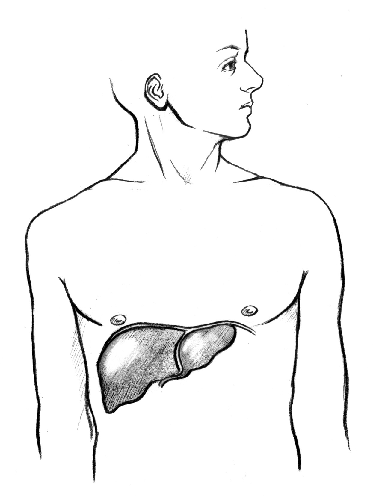
- NIDDK/NIH Media Library. Educational liver anatomy image asset (used above).
- OPTN/HRSA — Liver policy overview. Allocation context and policy framework relevant to access and urgency.